Agave Sync
Built a zero-to-one B2B SaaS product through close collaboration with pilot customers.
Challenge: Entering an Unknown Market
As a startup, our challenge was to launch our first product and find our foothold in a completely new market for us: construction companies. This was a leap into an industry that runs on deep-seated workflows with a healthy skepticism of “magic” software.
My goal was not just to design a product, but to earn the trust of a highly discerning, non-technical user base.
Role: Co-founder and Founding Designer
Being a co-founder and the sole designer for this initiative, I led all design efforts from the initial concept to post-launch evolution.
My responsibilities included:
- Product Strategy & User Research
- End-to-End UX Design
- Post-Launch Improvements
Discovery: Disambiguate Through Pilot Customers
Instead of betting the company on a single assumption, our first step was to lead a parallel discovery process for three distinct product concepts. The key wasn’t just to find an idea, but to find committed pilot customers for it — securing paid contracts before writing a line of code.
This process allowed us to test our hypotheses in the real world. One concept, Agave Sync, emerged as the one with the most urgent, unsolved user problem and the strongest, most willing early adopters.
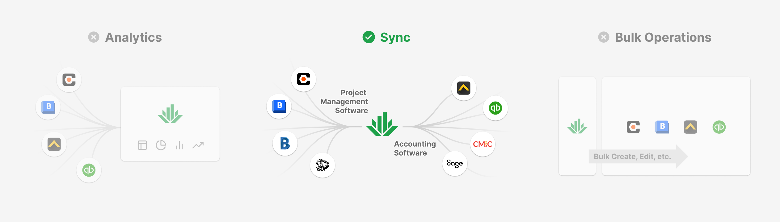 |
Most construction companies run on two most important software systems: one for project management and another for accounting, and they have to constantly keep data in sync between them, but it’s a tedious, time-consuming manual process. There were software solutions, but customers found them hard to use.
Foundational Insight: Transparency Over “Magic”
Our research in the existing solutions revealed their critical flaw: they were opaque “black boxes.” Users configure the sync job, let it run, and data comes out. They lacked control and were blind to the process, leading to immense frustration when errors inevitably occurred.
Existing solution:
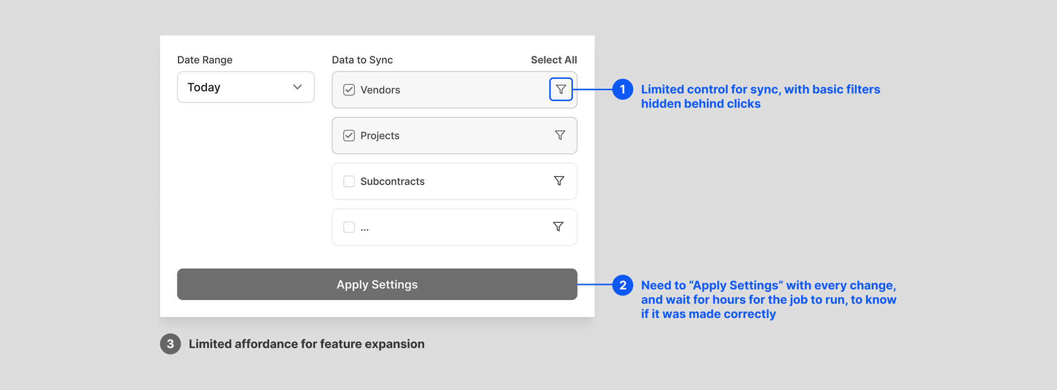 |
Wireframe created to capture the core user experience, not a real screenshot.
This led to my foundational design insight: for our users, transparency was way more important than simplicity.
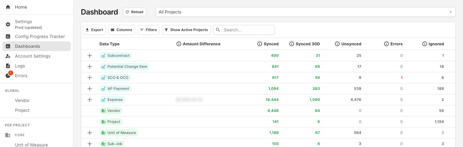
I made the strategic decision to reject the then industry-standard “control panel” and architect the entire product around a familiar, data-table-centric UI. This gave our users the visibility and granular control they needed to build trust in our system. It was a bet on user empowerment over a simplified, “magical” interface.
Agave design:
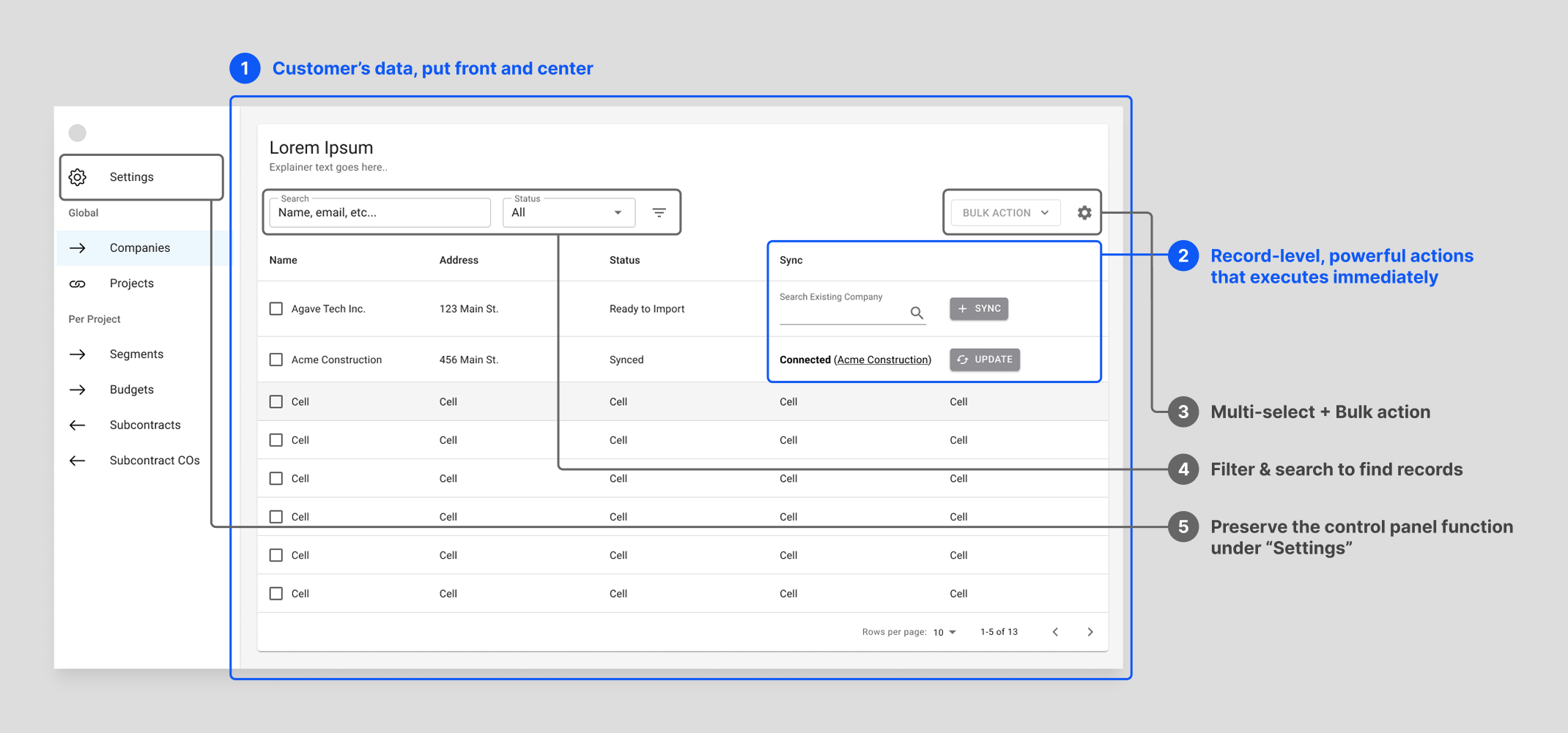 |
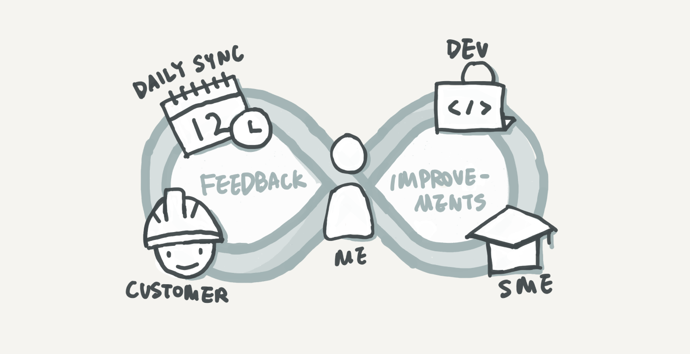
Process: Validating the Insight Through Deep Collaboration
To bring this vision to life and ensure it met real-world needs, I embedded myself with our first customer. This wasn’t just user research; it was a co-creation process for 8 months, including 7:30am standups each day and two on-site visits.
Every morning, I presented design iterations and got immediate feedback, allowing me to understand and refine every nuanced construction project finance workflow with our engineering team. We deliberately focused on workflow efficiency over aesthetic polish, and using a component library to ensure rapid iteration.
Outcome: User Evangelism and a Scalable Foundation
The result was a product our first customer loved so much, they became our most powerful evangelist. They showcased our product at Autodesk University, the industry’s largest conference, leading to a wave of inbound interest.
This authentic user praise was a direct result of the product’s design: a user-centric foundation that was built to last. The initial data-table architecture proved to be a durable and scalable system that gracefully evolved over time to meet new customer needs.
Product design timeline:
1. The Functional Core (Private Launch)
Focused on core functionality and usability over aesthetics, ensuring we solved the user’s most critical problems first.
 |
2. Public Launch Polish
Updated the component library and refined the visual design to build credibility and trust as we introduced the product to a wider audience.
 |
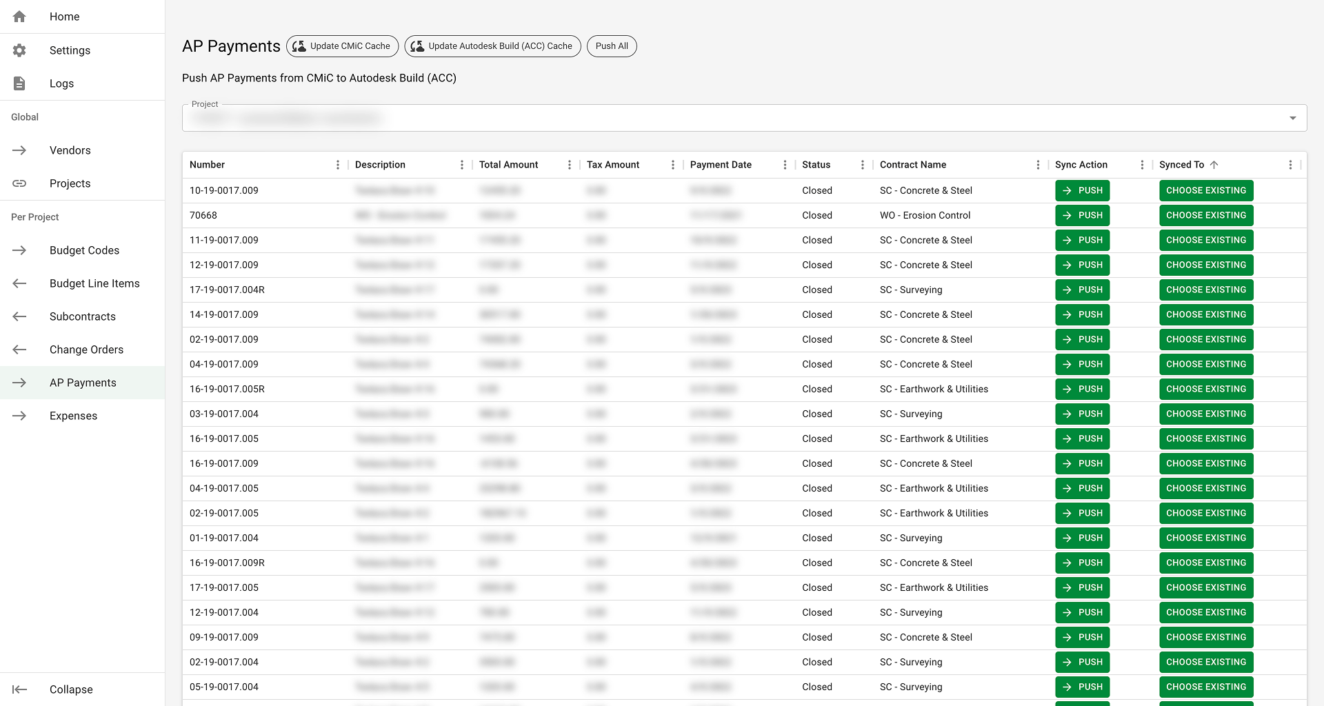
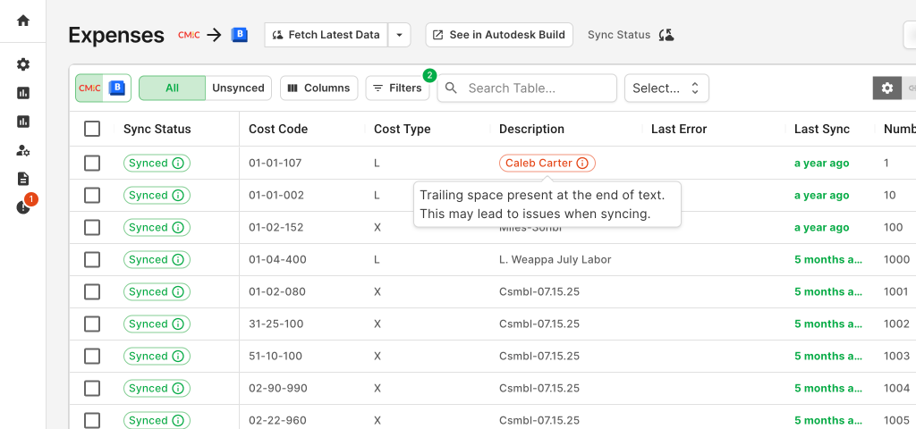
3. Solving the #1 Usability Issue: Horizontal Scroll
Consolidated many diagnostic and status columns into a single, scannable “Status” column, reducing horizontal scrolling—a major pain point we identified for our Windows users.
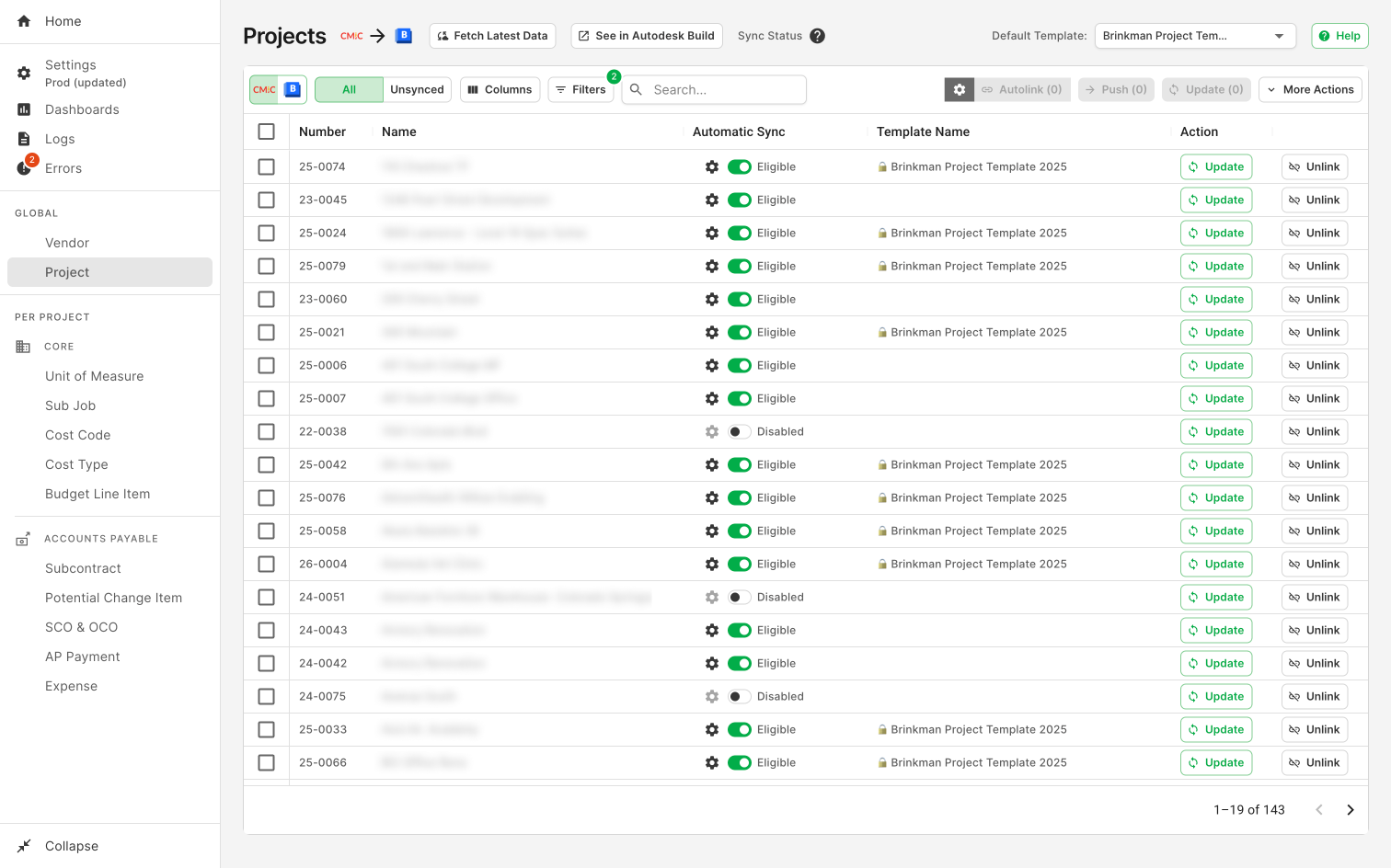
4. Systematic Feature Expansion
The strong design foundation supported years of subsequent development—from sync history and notifications to expanded user controls—without requiring a major redesign.
 |
 |
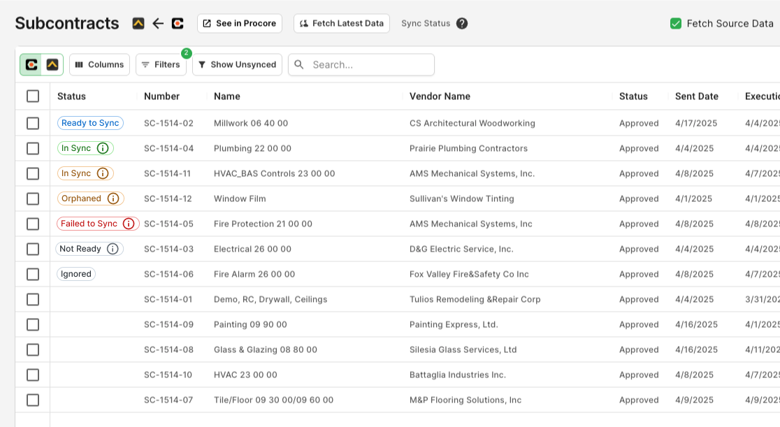
5. Proactive Design: Strengthening Trust
The design foundation provided the necessary affordance to proactively flag data-field-level issues, a feature that further strengthened our customers’ long-term trust.
Ultimately, this approach drove adoption from 0 to 17x growth the next year, to now 350+ customers, became our primary growth engine into the market, and established a key competitive advantage rooted in user trust.
I hope you find this article useful. If you want to get an email every time I write something new, subscribe to the list below.